Mettle Studio
A bold, vibrant visual identity for Mettle Studio, built around the courage and energy behind “Give it some mettle.”
Year / 2026
View on BehanceGive it some mettle.
Mettle Studio takes its name from an invitation to bring courage, spirit and energy to an idea. The agency needed its first cohesive identity, with the bold, vibrant personality its founder envisioned.
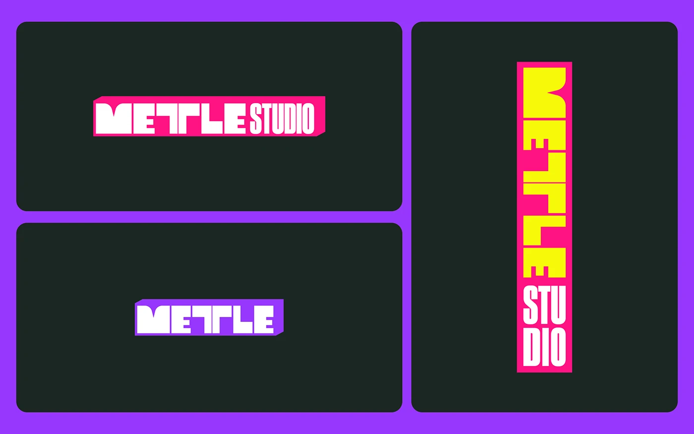
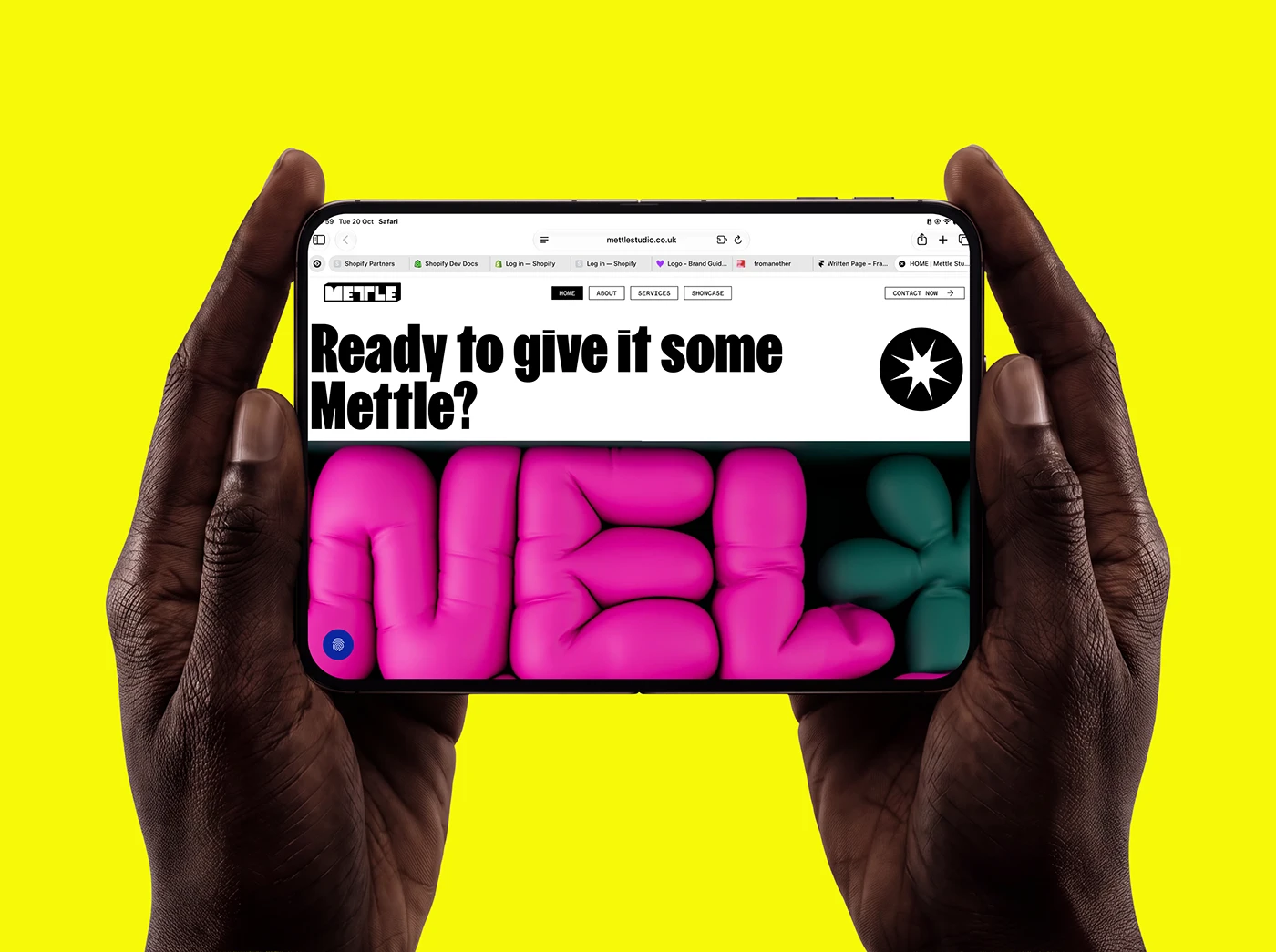
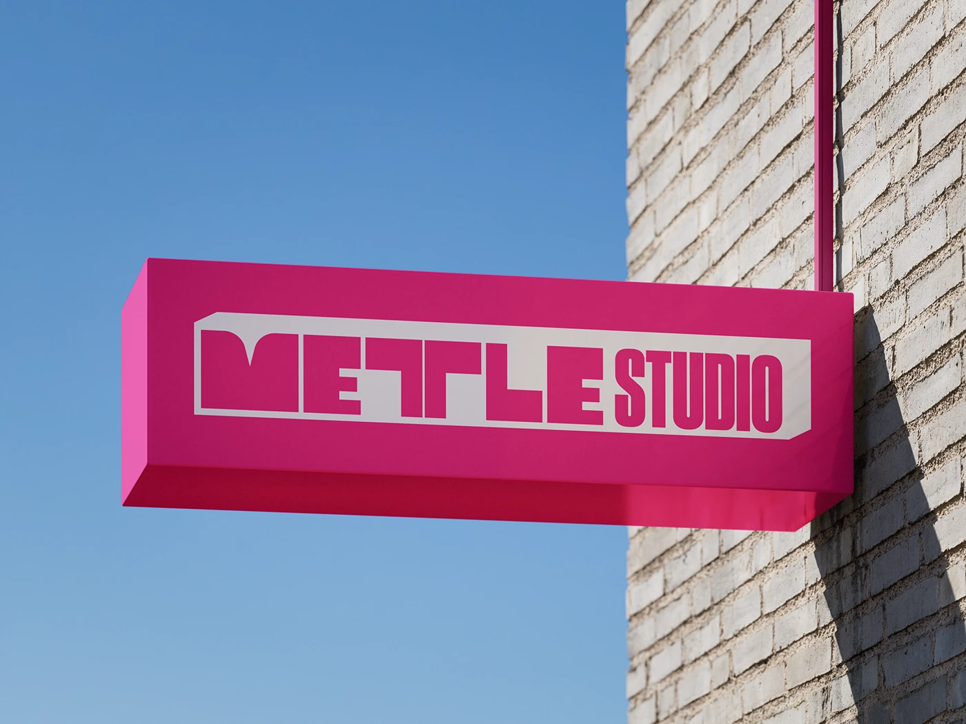
One of the main challenges was in the name itself. The double T created awkward gaps between the Ts and the L, disrupting the rhythm of the wordmark. Joining the Ts solved the spacing challenge while giving the wordmark a stronger, more cohesive structure. That connection reflects the spirit of Mettle: bringing courage, energy and resolve to an idea.
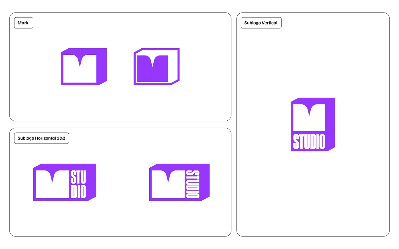
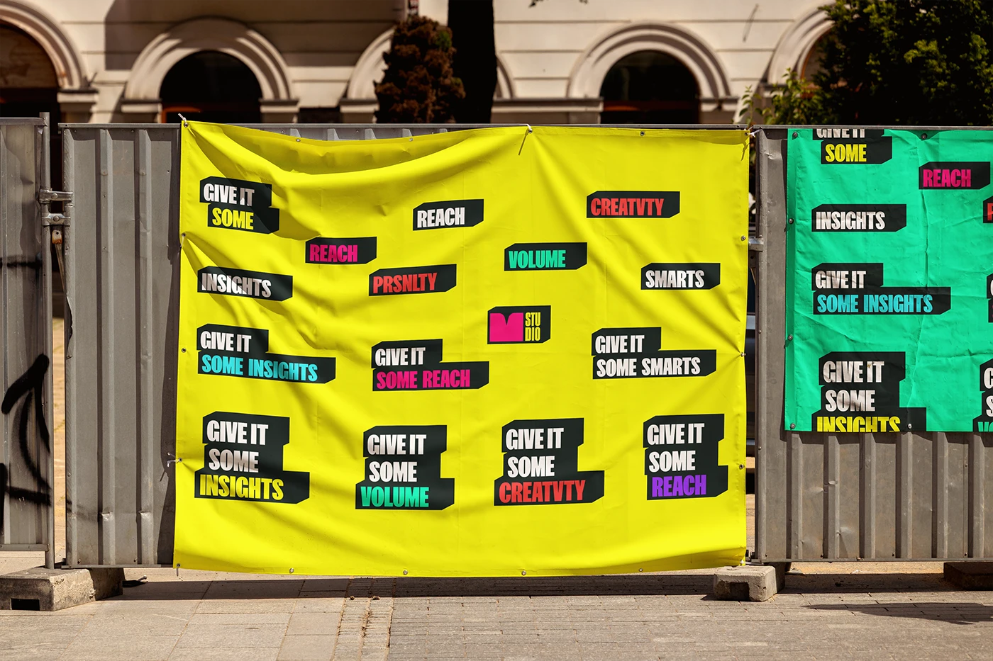
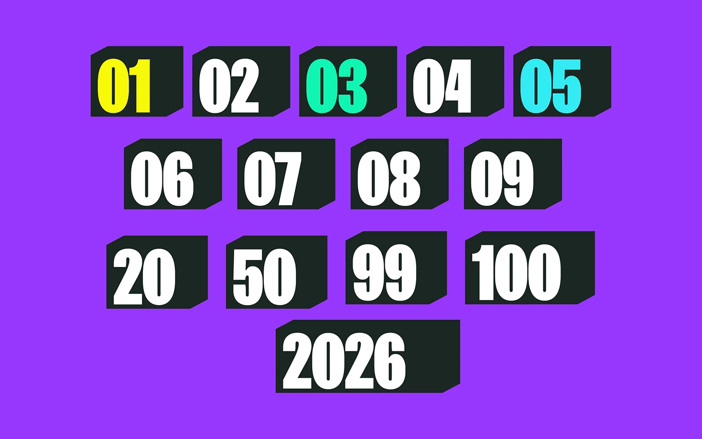
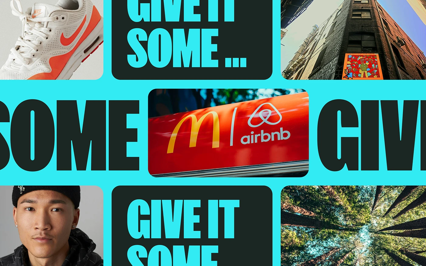
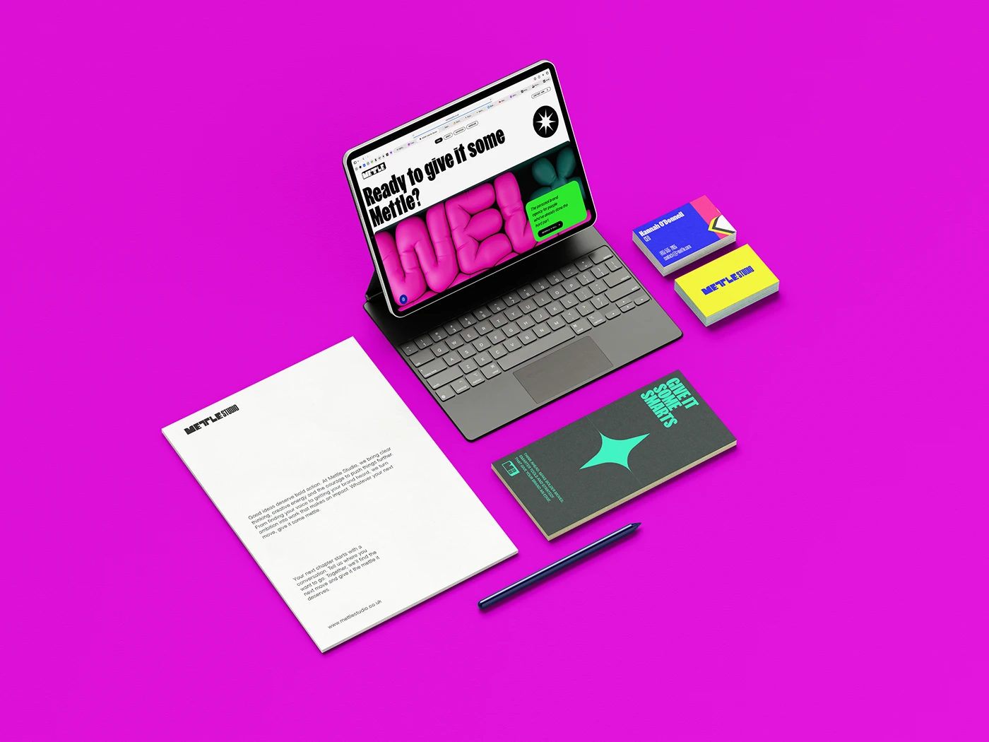
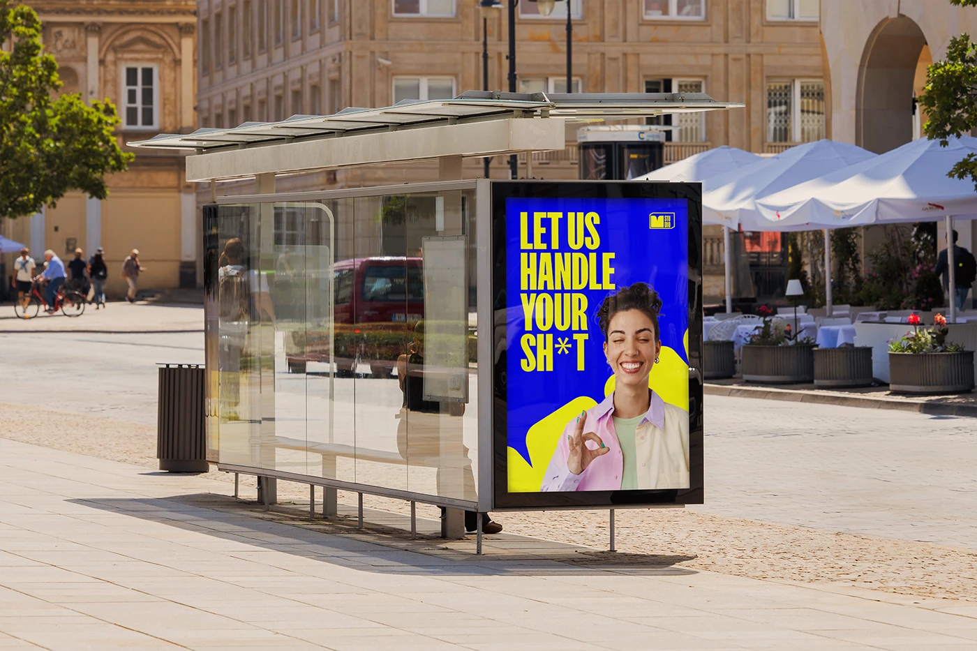
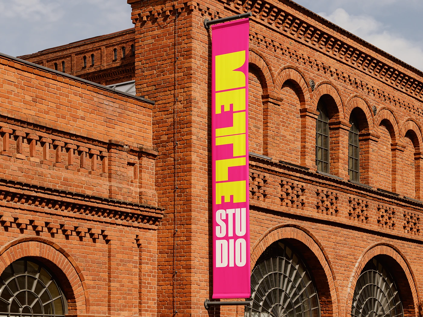
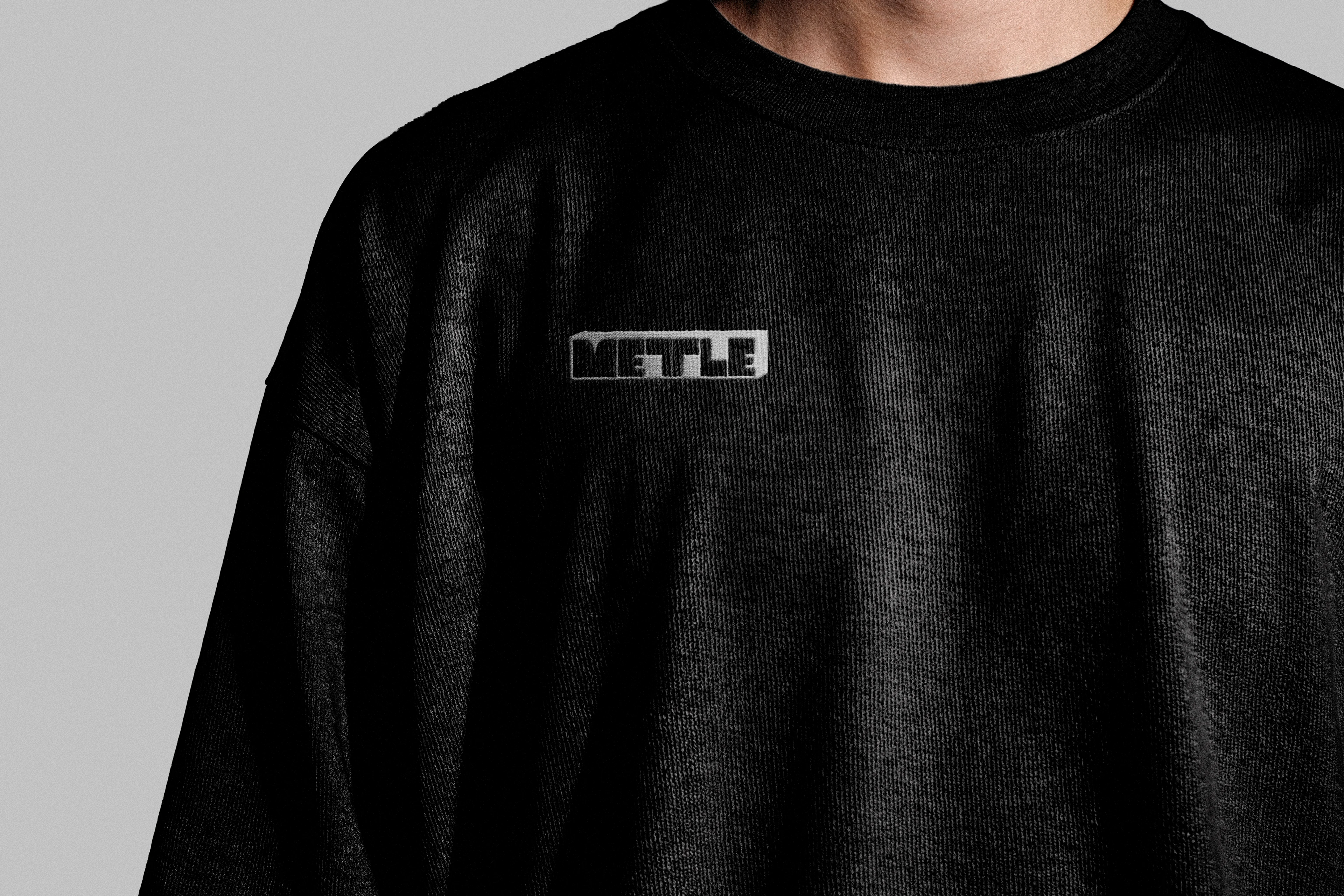
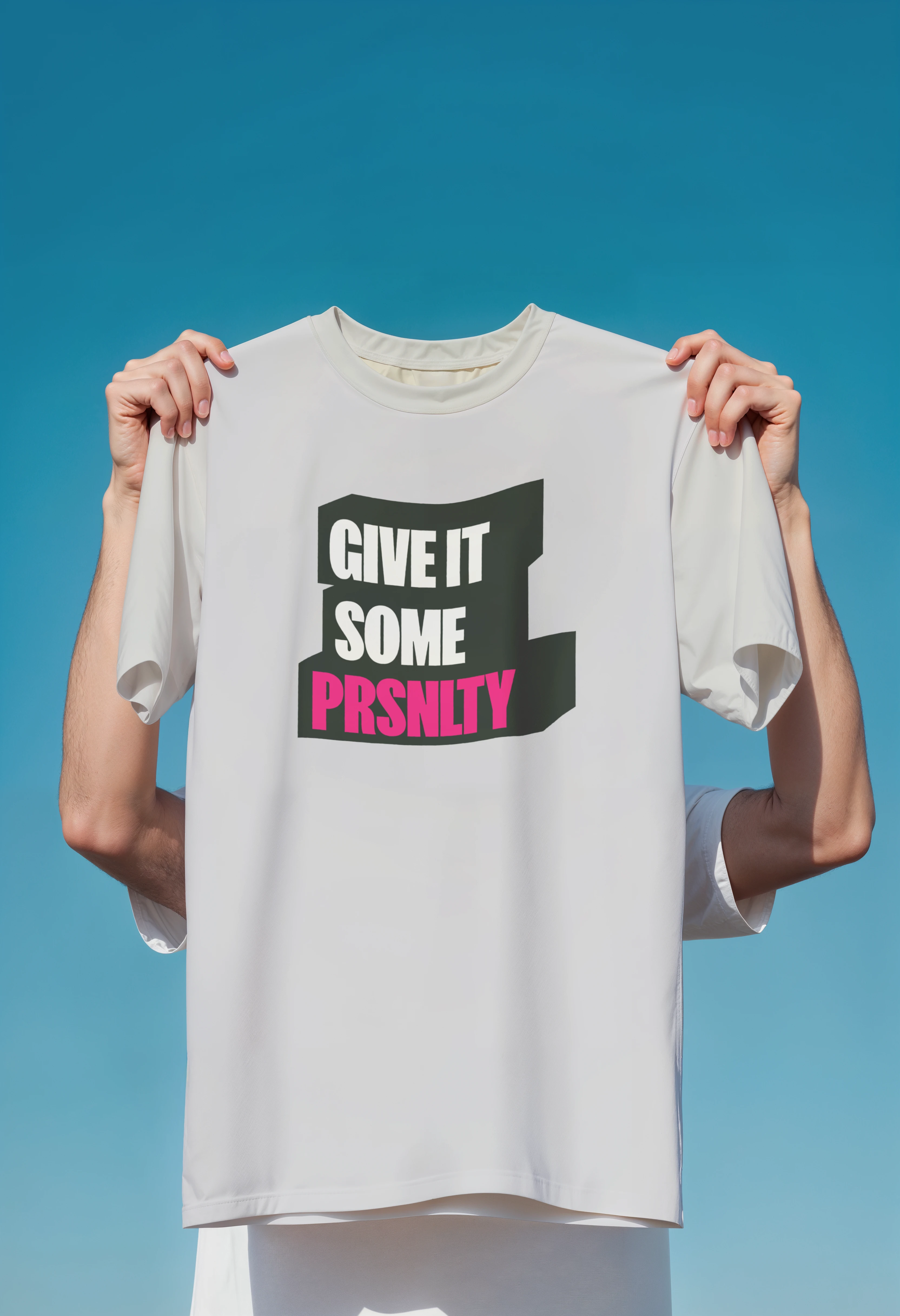
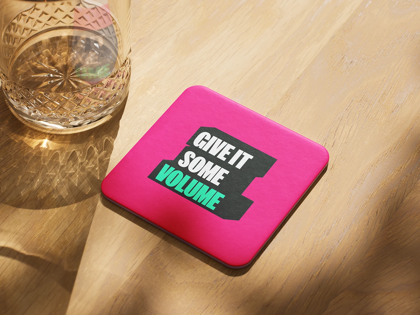
I developed a visual system built around expressive lettering, vivid colour and graphics drawn from the logo itself. The scope included the logo and lockups, colour palette, typography and graphic assets, with applications explored across social media, stationery, outdoor advertising, digital layouts and merchandise.
Art direction, brand design, graphics and animation by Fritz Rosemond.
BTS
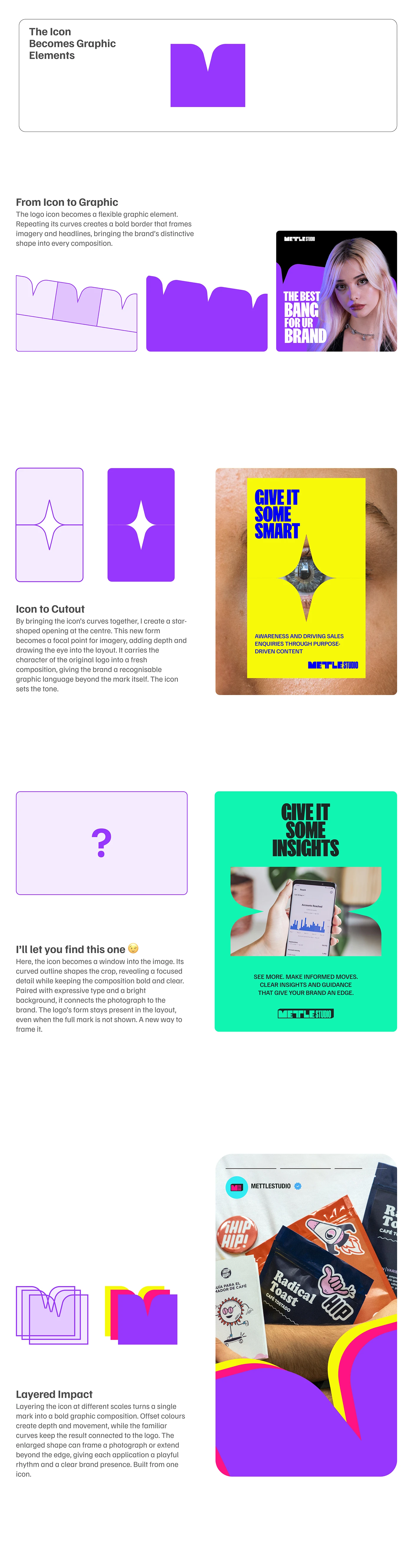
A look behind the scenes at how the logo became a graphic language. These explorations show how I isolated, repeated and recombined its shapes to create image frames, graphic elements and compositions for the wider identity.